How to Read Your Own Token Usage With the Explain-Usage Skill
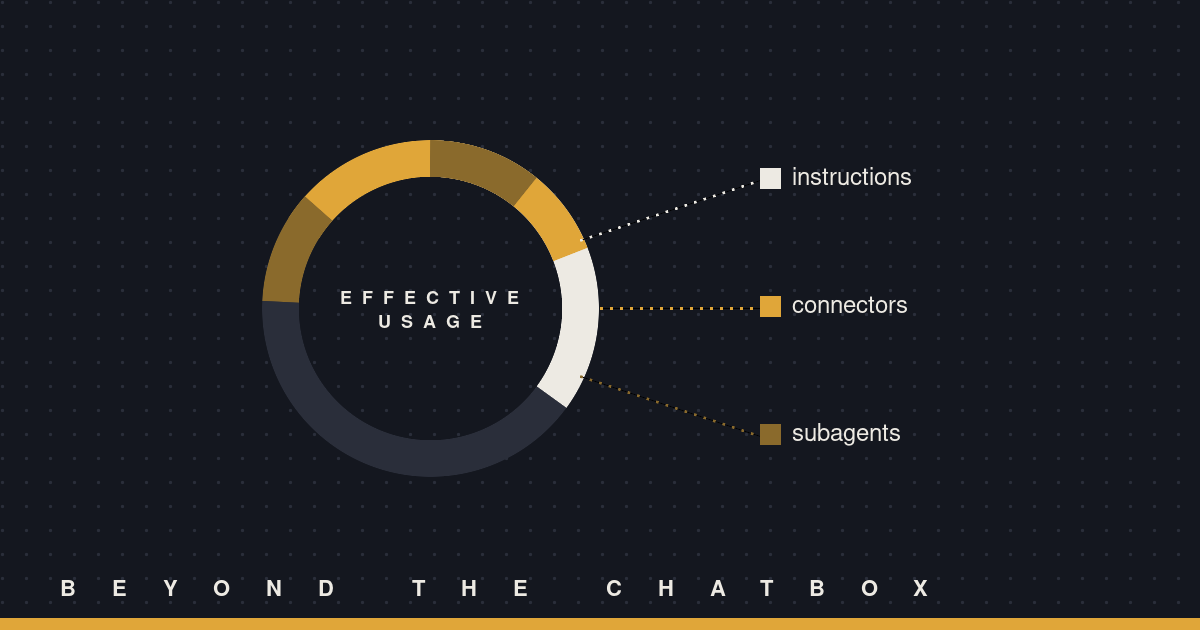
Ask “where did my tokens go” and most tools hand you a raw number. A session used however many thousands of tokens, full stop. That’s not an answer; it’s a receipt with no line items. There’s a skill built for exactly this question, and instead of a total, it gives you a breakdown you can actually act on: one chart, plain language, no spreadsheet.
What triggers it
You don’t have to know the skill’s name to get it. Say “explain my usage,” “where did my tokens go,” or ask for a usage breakdown, and it fires. That’s the whole ask. No file to open, no dashboard to navigate to first.
What it’s actually reading
Under the hood, a session’s full history lives in a transcript file on disk, a .jsonl in the Claude project folder. The skill opens that file directly and sorts what it finds into groups you’d recognize instead of raw API categories: Claude’s own instructions (the system prompt and tool list, which get re-sent every single turn, not just once), browser tool calls, each connector by name, web research, file operations, and subagents, counted separately by how many ran and what each one burned through. Anything that doesn’t show up gets left off the chart instead of padded in as a zero. If a connector’s name in the data is some unreadable ID, it gets described by what it does instead of printed as-is, so you’re not staring at a wall of hex strings trying to guess which one was Gmail.
Why the raw number lies
Not all tokens cost the same, and a plain sum treats them like they do. The skill weights them before adding anything up: cached reads count for about a tenth of a regular token, cache writes for about double, and output tokens for about five times a regular input token. That spread is the whole reason two sessions with similar totals can have wildly different real costs. A session that’s mostly rereading cached context is cheap even if the raw number looks big. A session that generated a lot of output, a long doc, a big piece of code, is expensive even if the total looks modest. The chart is built on that adjusted number, not the sticker number, which is the difference between a chart that’s technically accurate and one that’s actually useful.
Reading the result
The output is deliberately small: one chart, then a handful of short bullets explaining it in plain words, no jargon about tokens or context windows. If a session went sideways cost-wise, this is usually where you’d see why: a subagent that ran longer than expected, a connector that got called more than it needed to, or a system prompt that’s carrying more weight than the actual task did. None of that shows up in a single total. It shows up the moment the total gets split into pieces.
Where this actually helps
The obvious use is curiosity after a big session. The more useful one is catching a pattern before it becomes a habit: a scheduled task that’s quietly getting more expensive every run, a skill that spins up more subagents than the job calls for, a workflow that leans on web research when the answer was already sitting in a connected file. You won’t see any of that from a single number at the bottom of a session. You’ll see it from the shape of the chart.